

Tuesday, September 28, 2010
Fall Inspired...
My total failure in attempting to make a male FALL card is pretty evident! While I had out Masculine Motifs (the leaves) last week, I thought it'd be cool to give it a go and make a nice Fall card. I'm not quite sure what I think of this card although I will be honest, to me, it's more like vintage Hawaiian print?! Needless to say, I will stash this card away in the hopes that it will someday get used...lol!

Monday, September 27, 2010
Celtic Cross Notebook...
Sweet baby Kinley is PROOF that you can find crafting inspiration in even the smallest of packages! Over the Summer we made a long drive back to my hometown of Harrah, Oklahoma...arriving just in time for Kinley's birth! She is the first child of my dear friend Trisha and her hubby Christian. I love everything about this beautiful photo: the outfit, pose, and bright/vivid colors...so much so, I decided to turn this inspiration into a notebook! Photo is courtesy of Lisa Monahan Photography...based out of Oklahoma City. Not only does she do wonderful candid portraits, she was also gracious enough to allow me to post this image on my blog...BIG thank you Lisa!
 I did not have any zebra print paper (I do NOW!) at the time, so I opted for some leftover Doodle Bug paper. The cross pattern is hand cut on all 3 layers, so a bit time consuming, but so worth it. I was brave enough to stitch the cross even with the rounded inside corners (none of which you can see, because I ended up covering them up with my monogram!) and it gives a little more added texture. The bg hot pink is stamped with PTI's-Damask Designs and each black dot is separately stamped. Glitter is courtesy of my Stickles collection.
 Trisha and I...what's my excuse, my youngest is now 4 years old....LOL! Thank you for allowing us to share in Kinley's arrival!
 Photo is courtesy of Lisa Monahan Photography...based out of Oklahoma City. Not only does she do wonderful candid portraits, she was also gracious enough to allow me to post this image on my blog...BIG thank you Lisa!
 I did not have any zebra print paper (I do NOW!) at the time, so I opted for some leftover Doodle Bug paper. The cross pattern is hand cut on all 3 layers, so a bit time consuming, but so worth it. I was brave enough to stitch the cross even with the rounded inside corners (none of which you can see, because I ended up covering them up with my monogram!) and it gives a little more added texture. The bg hot pink is stamped with PTI's-Damask Designs and each black dot is separately stamped. Glitter is courtesy of my Stickles collection.
 Trisha and I...what's my excuse, my youngest is now 4 years old....LOL! Thank you for allowing us to share in Kinley's arrival!
Friday, September 24, 2010
Last Of The MAN Designs...
TGIF! This has been a super long week! I'm finished with these last few man cards, now I will go back and replicate them all for added stock. All these designs are fairly simple and it makes my job easier when I'm guided by a sketch. I {heart} my current issue of Paper Craft Magazine! Dabbling with Masculine Motifs again. I created my sea of fish with a little air brushing before I stamped on the bright orange koi...are they even in the sea or just pond fish?! Either way, they have fresh water! Something funny about this fish card...do you see the extra dots in between the eyelets?! They are NOT suppose to be there!!!!! I accidentally over punched with my stylus and after I saw what I did, I knew these would be TOO CLOSE to fill in with eyelets. My solution: skip every other hole...see, you would have never known!
 For the hunter! After I laid out my design here and stamped it up, I went back and added a slight air brush mist in medium blue...gives a more cozy and vintage look!
 I'm off to run errands! Have a splendid weekend!
 Dabbling with Masculine Motifs again. I created my sea of fish with a little air brushing before I stamped on the bright orange koi...are they even in the sea or just pond fish?! Either way, they have fresh water! Something funny about this fish card...do you see the extra dots in between the eyelets?! They are NOT suppose to be there!!!!! I accidentally over punched with my stylus and after I saw what I did, I knew these would be TOO CLOSE to fill in with eyelets. My solution: skip every other hole...see, you would have never known!
 For the hunter! After I laid out my design here and stamped it up, I went back and added a slight air brush mist in medium blue...gives a more cozy and vintage look!
 I'm off to run errands! Have a splendid weekend!
Wednesday, September 22, 2010
You Mean The World To Me...
Several cards, same sketch, different color methods! I've been saving myself a lot of time and sanity by using the same stamp sets and doing up several cards at one time. Usually when I stamp, I drag out all my supplies to only make one card/notebook...it's really a waste of time and lots of unecessary clean up. I'm hoping I'm on a role with this as it's really helping me stock up and be prepared for my first craft show. Adding to my manly collection of cards, I decided to pull out Masculine Motifs. Since I'm lite on the embellishments here, I decided to add a burst of color with my Copic Airbrush System. I do love those cans of air, but they sure don't last long and they are not the cheapest supply to replenish! On the card above I only wanted one globe so that it allowed for more view of the airbrush sky.
On the card below, you can see I added 3 globes and some brown speckles on the bottom. Creating the darker foreground really helped "close-in" the entire design. There is a little over spray of my speckles, but I'm still learning how close/far to hold the air can from my paper. This was actually the first card I did of the three. The only difference on this card is that the overall air brushing is much lighter in color. I think I'm also addicted to the PTI-Woodgrain bg ...which works GREAT for neutral cards!
 Adding to my manly collection of cards, I decided to pull out Masculine Motifs. Since I'm lite on the embellishments here, I decided to add a burst of color with my Copic Airbrush System. I do love those cans of air, but they sure don't last long and they are not the cheapest supply to replenish! On the card above I only wanted one globe so that it allowed for more view of the airbrush sky.
On the card below, you can see I added 3 globes and some brown speckles on the bottom. Creating the darker foreground really helped "close-in" the entire design. There is a little over spray of my speckles, but I'm still learning how close/far to hold the air can from my paper.
 This was actually the first card I did of the three. The only difference on this card is that the overall air brushing is much lighter in color. I think I'm also addicted to the PTI-Woodgrain bg ...which works GREAT for neutral cards!
Monday, September 20, 2010
You Da MAN!
How about a little BRIGHT in your Monday morning! I don't know what I was thinking when I decided on these bright colors, but I think they do this little googlie monster some justice! He reminds me of the character from Monsters Inc. and I think he'd also go great with a big "I LOVE YOU!" sentiment as well. The monster and sentiment are from Cornish Farms...am I a little behind, or did I read somewhere they went out of business? This is the only set I own from them, but gosh darn it this set is really cute! Little mix with my PTI-Woodgrains. I try not to over do it with the ribbons, embellishments etc. on my manly cards. I love the simplicity of these two cards.
 This one's for you HONEY! He never even looks at my blog anyway...he probably thinks I belong to a crafting cult!! I didn't like how the snap stamps looked, so I added the brads in between to help break up the sentiment.
 I'm off to finish up some Halloween goodie bags for Gracie. We just need to decide what we are going to fill them with! Happy crafting.
 Little mix with my PTI-Woodgrains. I try not to over do it with the ribbons, embellishments etc. on my manly cards. I love the simplicity of these two cards.
 This one's for you HONEY! He never even looks at my blog anyway...he probably thinks I belong to a crafting cult!! I didn't like how the snap stamps looked, so I added the brads in between to help break up the sentiment.
 I'm off to finish up some Halloween goodie bags for Gracie. We just need to decide what we are going to fill them with! Happy crafting.
Friday, September 17, 2010
So how many of you go on shopping sprees for paper just to hoard and hoard?! I'm pretty darn guilty of the same habit, but I'm trying my best to just use the paper up. Seriously, you can always buy more, maybe not in the same pattern, but it's always fun to try something new. My favorite paper packs are from DCWV and My Mind's Eye. Now, I own other paper from a number of manufacturer's but I really love the patterns on these two. I made this card with DCWV-Sweet Shoppe. The patterned paper looks like several layers, but the chocolate glitter sheet and white scalloped edge are all 1 layer. Should make it quick and easy to put this card together, but it took me well over 2 hours to decide to how to lay it out and whether I wanted a single stitch or my signature swirly stitch. I brought out my PTI-Spiral Bouquet and used some floral backgrounds before adding "Bloom".
 I've been cleaning out files from the last 3 years of blogging...my fingers are aching! All this to share a new page with you ;) If you're interested, you may now become a fan of JadeMingmei Designs on Facebook!!! This sight is set up per request of friends and family who would like to see all projects in a single page format. This FB page is by no means keeping me from blogging...only single images will be posted there and I will still keep the same detailed format here on my blog!
Enjoy the weekend!
Dawn ;)
 The patterned paper looks like several layers, but the chocolate glitter sheet and white scalloped edge are all 1 layer. Should make it quick and easy to put this card together, but it took me well over 2 hours to decide to how to lay it out and whether I wanted a single stitch or my signature swirly stitch. I brought out my PTI-Spiral Bouquet and used some floral backgrounds before adding "Bloom".
 I've been cleaning out files from the last 3 years of blogging...my fingers are aching! All this to share a new page with you ;) If you're interested, you may now become a fan of JadeMingmei Designs on Facebook!!! This sight is set up per request of friends and family who would like to see all projects in a single page format. This FB page is by no means keeping me from blogging...only single images will be posted there and I will still keep the same detailed format here on my blog!
Enjoy the weekend!
Dawn ;)
Wednesday, September 15, 2010
Butterfly Garden Combo...
When I uploaded my last post, I discovered a new feature on Blogger which allows you to easily design and update your blog! For those of you on Blogger, this feature is in the upper right hand of your blog page...just click on "Design" and go to town. I don't like anything over the top, but it MUST be some shade of green ;). I also changed the font to Italic for something different. I know this font can sometimes be annoying when reading, so let me know what you think and if it's easier in the block letter format.
Anyhoo, I'm almost embarrassed to say how long this project has been done and NEVER got sent. You may have seen it within the background of my other photo posts! The mailboxes have been completed and sitting on my stamp rack for well over a YEAR! Who does that?! Needless to say, other than these gifts, I'm pretty good about getting them out on time.
 Patterned paper is from DCWV Butterfly Garden. I used my PTI-Take Note along with my nesty dies for the circles. The zig-zag stitch is not something I use often, but I think it adds a wonderful touch here since the patterned paper is only 2-dimensional.
 LOVE, LOVE, LOVE these mailboxes!
  Sweet little monogram.
 These butterflies are REALLY cool. They are Ghost Shapes by Heidi Swapp and I picked up about 175 of them for a $1.00! She obviously didn't know what she had on her hands! I bent the smaller one (to look like the wings were fluttering) and added some E6000 for a super strong hold. I then added some rhinestones down the spine.
 Left side of the mailbox.
Anyhoo, I'm almost embarrassed to say how long this project has been done and NEVER got sent. You may have seen it within the background of my other photo posts! The mailboxes have been completed and sitting on my stamp rack for well over a YEAR! Who does that?! Needless to say, other than these gifts, I'm pretty good about getting them out on time.

 Patterned paper is from DCWV Butterfly Garden. I used my PTI-Take Note along with my nesty dies for the circles. The zig-zag stitch is not something I use often, but I think it adds a wonderful touch here since the patterned paper is only 2-dimensional.
 LOVE, LOVE, LOVE these mailboxes!
  Sweet little monogram.
 These butterflies are REALLY cool. They are Ghost Shapes by Heidi Swapp and I picked up about 175 of them for a $1.00! She obviously didn't know what she had on her hands! I bent the smaller one (to look like the wings were fluttering) and added some E6000 for a super strong hold. I then added some rhinestones down the spine.
 Left side of the mailbox.
Monday, September 13, 2010
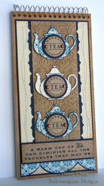
Tea Time...
I've had a busy weekend in the studio. The weather is cooling down nicely and we had a mix of heavy clouds and rain, which makes for perfect crafting time! it's a hard toss between doing lawn work and playing with my stamps, but after a hard Summer in the yard (lots of new plants and trees!) I'm more than ready for the grass to die off! In the meantime, I'm going to get my craft show paperwork filled out and sent off today ;-) . It's a really exciting time!
I dusted off my "Tea for Two" yesterday and came up with this little notebook. I was inspired with the neutral colors after I saw THIS card by Kelly Lunceford. Her card is simply gorgeous! I really didn't know what look I was going for here with the printed tea pots. I couldn't vision leaving them blank, so the "tea company" emblem fit nicely. If I were personalizing the tea pots, a nice monogram or even a small "friend" stamp would fit nicely too! A bit a stitching and nice embossing (courtesy of my Cuttlebug folder) finish off the look.
 Looks to me like something is missing here! I thought about adding some more vintage brads to the sentiment but thought it might be overkill. After sleeping on it last night, I think leaving it just the way it is, was the right thing to do! I love it! There will be more of these for sell at the show...tea pots are stamped and waiting to be cut...any volunteers?!!
I dusted off my "Tea for Two" yesterday and came up with this little notebook. I was inspired with the neutral colors after I saw THIS card by Kelly Lunceford. Her card is simply gorgeous!
 I really didn't know what look I was going for here with the printed tea pots. I couldn't vision leaving them blank, so the "tea company" emblem fit nicely. If I were personalizing the tea pots, a nice monogram or even a small "friend" stamp would fit nicely too! A bit a stitching and nice embossing (courtesy of my Cuttlebug folder) finish off the look.
 Looks to me like something is missing here! I thought about adding some more vintage brads to the sentiment but thought it might be overkill. After sleeping on it last night, I think leaving it just the way it is, was the right thing to do! I love it! There will be more of these for sell at the show...tea pots are stamped and waiting to be cut...any volunteers?!!
Thursday, September 9, 2010
Because of The Brave...


Wednesday, September 8, 2010
Just a Note...
Using some more of that splendid spring paper pack as the previous post. I have to say, for the longest time I was hooked on "pinks & greens" but, my oh my, do I LOVE this paper. It's nice to switch things up a bit and this paper, at certain angles, has ooodles of sparkle! SEEEEEE! Lots of sparkles! I knew I didn't want to cover up such pretty paper, so a simple "just a note" was small enough to matte on my patterned paper.
 Usually when it comes to adding ribbon on my cards and notebooks, I generally tie bows. Keeping in mind with postage and shipping rates, the flat ribbon will save me! Love the detail as well with the Fiskar's Upper Crest Punch.
 I'm off to put in my application for my first craft show this morning! If your going to be in the local area, I will be doing the Marston Pavilion Show aboard Camp Lejeune in November. I will be sure to update once I get all the information.
 SEEEEEE! Lots of sparkles! I knew I didn't want to cover up such pretty paper, so a simple "just a note" was small enough to matte on my patterned paper.
 Usually when it comes to adding ribbon on my cards and notebooks, I generally tie bows. Keeping in mind with postage and shipping rates, the flat ribbon will save me! Love the detail as well with the Fiskar's Upper Crest Punch.
 I'm off to put in my application for my first craft show this morning! If your going to be in the local area, I will be doing the Marston Pavilion Show aboard Camp Lejeune in November. I will be sure to update once I get all the information.
Monday, September 6, 2010
Because She Deserves MORE Than Apples...
Well, happy to report, Earl spared us with just a little rain and subtle winds. I guess after Katrina, the weather folks like to over estimate their forecasts...that way if my patio furniture did drift off they can say, "told you so!"
Anyhoo, on to this sweet notebook I made for Gracie's teacher. Because I hope to get ahead of the game this year, all my gifts and things for Gracie's school will be done AND ready BEFORE I actually NEED them ;). I'm classic for waiting until last minute and it drives me crazy! This notebook is being stashed for Christmas! Woot woot! I haven't used this Me and My BIG Ideas stamp since THIS project. Along with dusting off my stamp set, I also brought out a new (to me) paper pack. You will see a few projects this week with the Flower Shower Spring Stack (DCWV) which contains many glitter pages that are super sparkly! I decided on the last time I used this stamp it wasn't jazzy enough on the background and I had envisioned using a soft cloud and grassy design. To create the clouds, I cut them out with Eclipse Tape from my PTI cloud die. The Eclipse Tape is much like a post-it sheet, but the entire sheet is sticky allowing great, sealed coverage when using your Copic marker airbrush system. Once I placed the large clouds, I went back and tape down some smaller clouds, which created a nice layered image. The grass is also the same technique, however I used the NEGATIVE image of my grass die (MFT) and drew the sidewalk on by hand.
 Lots of stitching! It really ties the whole design together...my sewing machine is a workhorse!

Anyhoo, on to this sweet notebook I made for Gracie's teacher. Because I hope to get ahead of the game this year, all my gifts and things for Gracie's school will be done AND ready BEFORE I actually NEED them ;). I'm classic for waiting until last minute and it drives me crazy! This notebook is being stashed for Christmas! Woot woot! I haven't used this Me and My BIG Ideas stamp since THIS project. Along with dusting off my stamp set, I also brought out a new (to me) paper pack. You will see a few projects this week with the Flower Shower Spring Stack (DCWV) which contains many glitter pages that are super sparkly!
 I decided on the last time I used this stamp it wasn't jazzy enough on the background and I had envisioned using a soft cloud and grassy design. To create the clouds, I cut them out with Eclipse Tape from my PTI cloud die. The Eclipse Tape is much like a post-it sheet, but the entire sheet is sticky allowing great, sealed coverage when using your Copic marker airbrush system. Once I placed the large clouds, I went back and tape down some smaller clouds, which created a nice layered image. The grass is also the same technique, however I used the NEGATIVE image of my grass die (MFT) and drew the sidewalk on by hand.
 Lots of stitching! It really ties the whole design together...my sewing machine is a workhorse!

Thursday, September 2, 2010
I spent yesterday afternoon crafting with some fun new toys...because who really wants to be hunkered down for hurricane Earl? I have yet to bring in the patio furniture and the kids toys. I'm probably more in denial about how "bad" this storm is actually going to be? The storm is predicted to hit us between 5-7 p.m. this evening so we will be prepared by then! In the meantime, I plan to stay in my studio over the long weekend and get on some projects I've been eager to try. I've already got teacher gifts completed for Christmas...SCORE!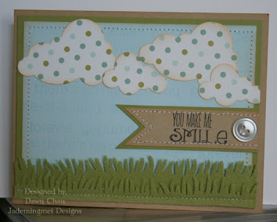 This is a sweet little card I made for my girlfriend to go with this lovely GIFT. Since I knew I wanted to use the new felt with the grass die from MFT and cloud die from PTI, I kept the bg simple by arranging a few words from Friends 'til the End. Both manufacturers dies work great! I loved how well the felt cut the grass. The felt is soft to the touch and leaves no frays or excess material after releasing from the die. I did notice while attempting to sew with the felt though, that it does have a tendency to stretch under my sewing foot. Almost forgot, there is one more of my favorite stamp companies, Verve Stamps-Blue Skies that I used for the sentiment.
 Alright, enough procrastinating! I've got things to get done today and they CAN'T wait! Going out to get a few things, then home to put on a pot of chili and ride out this storm!
 This is a sweet little card I made for my girlfriend to go with this lovely GIFT. Since I knew I wanted to use the new felt with the grass die from MFT and cloud die from PTI, I kept the bg simple by arranging a few words from Friends 'til the End. Both manufacturers dies work great! I loved how well the felt cut the grass. The felt is soft to the touch and leaves no frays or excess material after releasing from the die. I did notice while attempting to sew with the felt though, that it does have a tendency to stretch under my sewing foot. Almost forgot, there is one more of my favorite stamp companies, Verve Stamps-Blue Skies that I used for the sentiment.
 Alright, enough procrastinating! I've got things to get done today and they CAN'T wait! Going out to get a few things, then home to put on a pot of chili and ride out this storm!
Subscribe to:
Posts (Atom)