hey dawn, this is super adorable! what a cute idea! copic coloring ink---Palette Noir from Superior (papertrey sells it) or Brilliance Graphite Black from Tsukineko. and yes--just say no to the glossy paper!! again i'll send you to papertrey for their white cardstock--NONE better and perfect for copics. it's all i use! i hope this helps and i hope you don't think it too presumptuous of me to give you such a strong opinion. it's just what works for me!!! hugs, sus
Susie---Thank you so much for helping me out with this issue! You are the best:) I do have the PTI cardstock on hand, which I use quite often, just was using the wrong CS for copic coloring. I was totally going to buy the Palette Noir from PTI as well, but there was no refills in stock, so I opted for the True Black they sell...which totally did not work well at all...it smeared really bad. Soooo, back to ordering the Palette Noir to give it a try! Again, thanks for taking the time and helping me out...you ROCK!
Flipfloppingmamma said...
Where did you get the paper for these? Especially the strawberry one...LOVE IT!
Flip (I totally should ask her "real" name eh?)--is referring to the paper I used in THIS post with the post-it pads. The strawberry paper is from the Sonoma-Scenic Route line which I purchased at Archiver's in GA, but I'm sure any of their stores will carry it. The other papers I used in that post were older papers I just had in my stash and needed to use up.
Aside from the fundraising work I've been doing, I've also been busy doing a few things for some close friends and I thought I'd share them with you all. Invitations are probably one of my favorite (besides altering things!) crafting projects to work on. I especially enjoy doing baby announcements...kind of like getting my baby fix, but without the kid "actually" being here...lol There are several different orders I was working on, but figured I'd just throw all the invite samples on one post!
 Using my PTI-Garden of Life set I decided to add some depth to the flowers by stamping a separate rose in the center and used pop dots for a 3-D effect. I also added some crystal stickles for sparkle.
 Now she's a beauty if I may say so myself! Its been a while since I've inked up my Bella Stamps and I remembered having this one in my stash. I colored her with my copic markers and to "ground" the image I simply added a little cool grey color on the bottom..
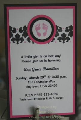
 Because I couldn't seem to use just ONE set on this design, I combined several of my PTI sets. The sets include: Damask Designs, Polka Dot Basics (the smallest dot in the set), With Sympathy-Loss of a Child (the little pair of feet). I really like the color combo here as well!
 Some more PTI (yes, I love their stamps!) goodness!
 This is the Verve Set I can't seem to put down. I've been using the butterfly in this set A LOT, but decided to use the flower for a change!

 There are lots of little girls being born around me and I think I might just copy one of these designs to use for my new niece who is set to arrive in July! I will go ahead and make these up for my Sister and make sure the envelopes are pre-stamped with postage...she knows I'm good like that and it's one less thing she'll have to tend to after bringing Katelyn home!
SOO CUTE!!! You (almost) make me want to have a baby so you can make me some..heehee.. WHat font are you using in those invites???
ReplyDeleteThese are gorgeous!!!! BTW, I hate to say this but the Gina K paper is even better for Copics!!!
ReplyDelete